
The Spreadsheet Experiment
Can you test a strategy in a spreadsheet? Maybe, but it doesn't appear worth it.

Oh, boy. Larry, you are on a losing streak lately. First, you learned about the limits of the Sierra Chart DTC server capabilities (big bummer, really). Now, you got several days into the spreadsheet experiment and are about to call it quits. What happened?
Well, something predictable happened. Spreadsheets suck for complex tasks. I knew that, you knew that, everyone knew that. But, I wanted to test it. I wanted to KNOW why we don’t use spreadsheet apps. Besides, you can easily formulate features and trade signals and many of the other things you need when testing a trade idea. So, why can’t you do everything inside one?
Simple.
Spreadsheets aren’t relational. They are just tables. You can mimic database techniques, and you can mimic programming formulas, but it isn’t a database or a programming language, and the limits really show when you try and do all the things you can do with Python (or whatever your favorite language is).
The very first thing I noticed is how slow it is. I loaded a year’s worth of minute data into the spreadsheet and my computer started crawling. 350k rows of data is too much to handle. I switched to daily data to make it easier on myself. I got indicators calculated, I got signals produced, and then I tried aggregating trades…
And that’s when I quit. It is just unwieldy. Even generating a simple list of trades after calculating signals turned into a nightmare. It looks great in the screenshot:
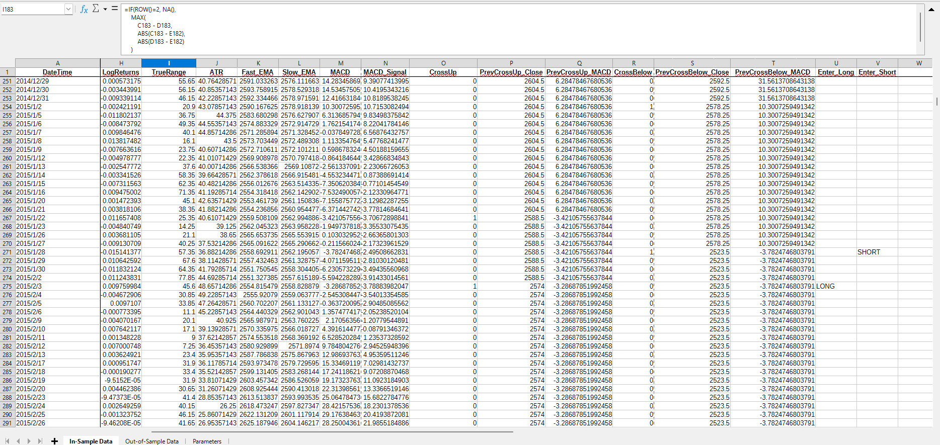
Sexy, right?
BUT, from here, it would literally be easier to export it to CSV and finish in Python. What does that mean?
The test is over.
So, another failed experiment. And I was really hoping to release this strategy for subscribers to review. Guess I will just need to get quantKit up and running instead.
There is something beautiful about this, though. All of this experimenting is learning. I am learning how to visualize data and how to think about handling data. All of this is applicable to how I intend on handling data within quantKit, and it helps me visualize how to actually backtest ideas accurately.
Before all of this, I just traded like any other trader. I would build visual charts, add a couple indicators/features I used to help target a trade, draw my lines, and trade. What I realize now is that even with a strict “strategy”, this is just gambling. The game is in managing risk, and the strategy just helps with that. Just like poker (my favorite is Texas Hold’em), you can make a living managing risk. But at the end of the day, it’s gambling.
I really learned this when I started looking at testing trade ideas with code and math. First, it was difficult to put some of the strategies I had tried into strict criteria, as I couldn’t articulate why I did something. A good example is putting horizontal lines at support levels based on a aggregated OHLC chart. I didn’t understand that what I was looking for was liquidity pools and I certainly didn’t understand how to spot them with code.
Now, I know better. I understand where to look, I am learning how data actually flows from the market to my computer, I understand how people can build an edge just by taking advantage of location (whether physical co-location or outside the kernel), and I understand that what most traders do (even the ones who are building algorithmic systems) is gambling.
Anyway, this wasn’t meant to be a philosophical piece, so I am going to stop here. You get the point.
If you didn’t, here it is:
Spreadsheets aren’t good for this kind of work. I wasted more time testing another idea when I could have been coding quantKit.
They did teach me a valuable lesson: don’t force tools to do what they weren’t built for. quantKit exists (or will exist?) because research deserves real structure, not a grid pretending to be a database.
Happy hunting.